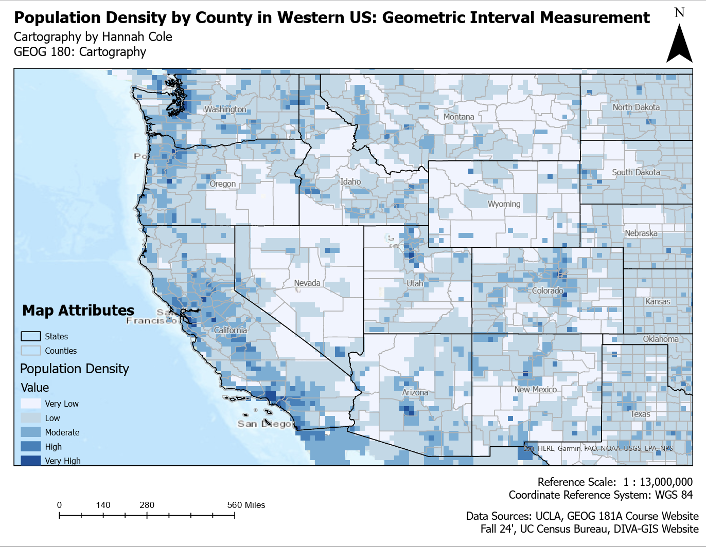
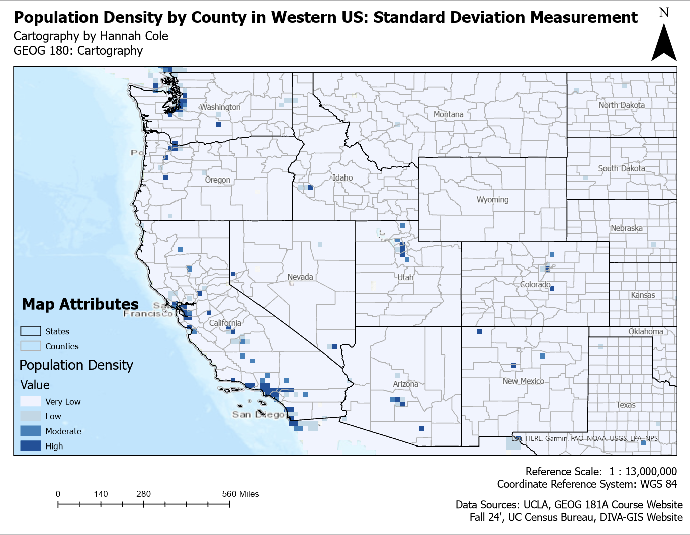
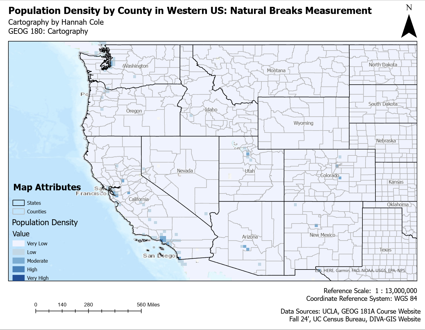
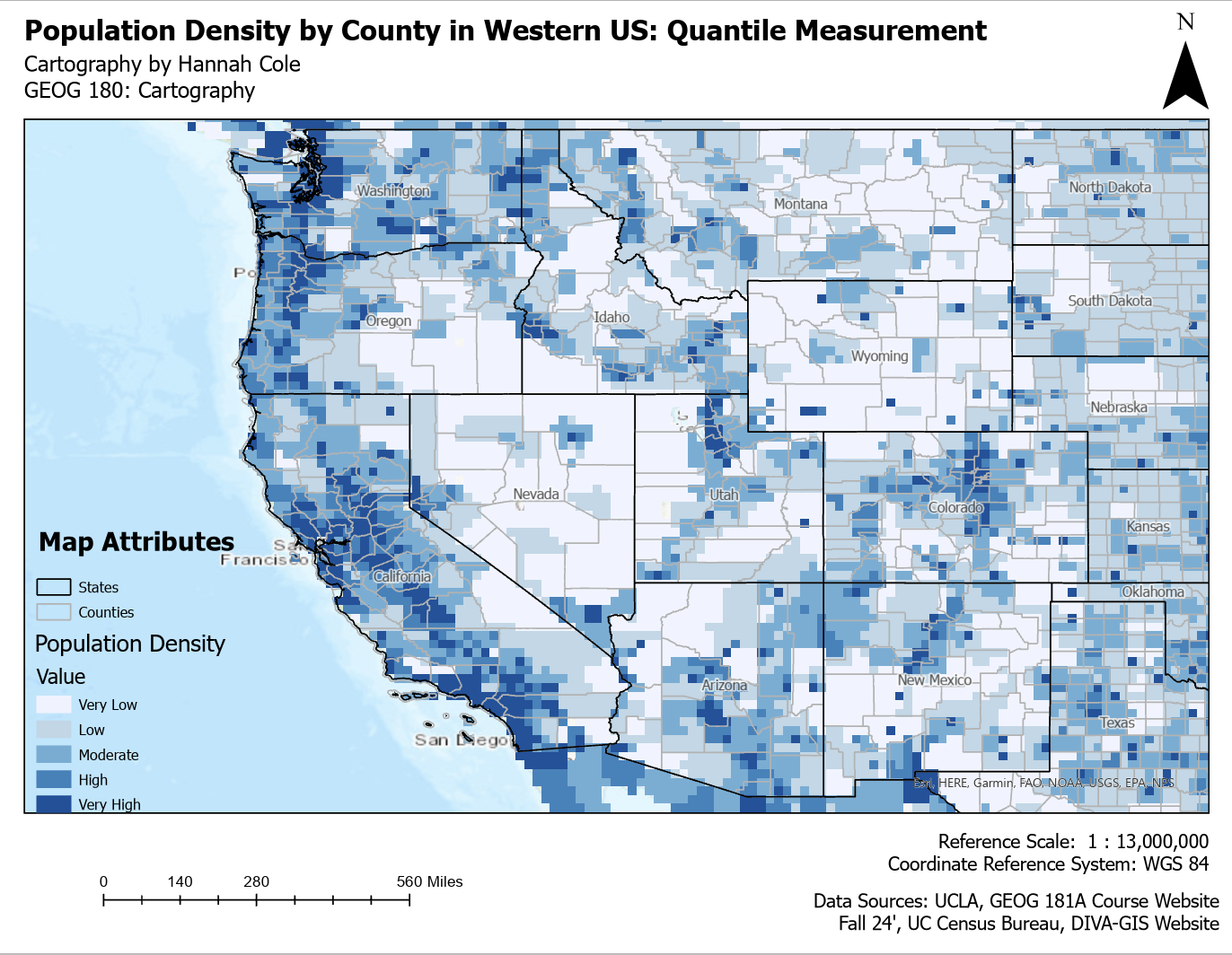
Similar to a book, all good maps work to portray a story. However, the narrative of this story can be conveyed differently depending on the means used to display it. All four maps below show population density in the Western United States. What may shock you is that they all use the same dataset. Why do they all look so drastically different you may ask? When conveying data, specifically geographic data, there are various way you can show it. A way to do this is classifying the data differently. The only difference in the maps below is how the data is classified. These four classification methods impact how population density is grouped and visualized. Geometric Interval ensures balanced distribution while preserving patterns, making it good for skewed data. Standard Deviation highlights extreme values by showing how much they deviate from the average. Natural Breaks (Jenks) identifies natural groupings, making patterns stand out more clearly. Quantile divides the data into equal-sized groups, which helps with comparison but can exaggerate differences. The best method depends on the data and the story the map is meant to tell.